Saas Tools
|
8 August 2025
The Only (5) Five Number Summary Calculator You’ll Need in 2025
Written by Faizan
Full Stack Developer
Use our Five Number Summary Calculator to quickly find the minimum, Q1, median, Q3, and maximum. Fast, accurate, and perfect for all your data analysis needs!

Table of Contents
Unlock the power of data analysis in seconds with a five-number summary calculator. This comprehensive guide covers everything you need to know about the five-number summary, from its calculation and interpretation to real-world applications.
You'll also discover valuable tips for deeper data analysis, visualization, and outlier detection using the interquartile range (IQR).
Whether you're a student, researcher, or data analyst, mastering the five-number summary equips you to summarize and analyze data with confidence and efficiency.
What Is the Five-Number Summary?
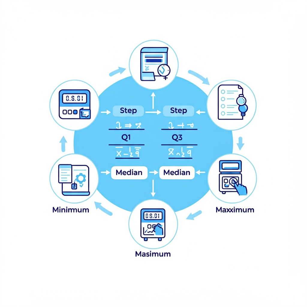
The five-number summary condenses a dataset into five essential values:
- Minimum – The smallest data value in the set.
- First Quartile (Q1) – The 25th percentile, marking the lower quarter of the data.
- Median (Q2) – The middle value (or the average of the two middle values).
- Third Quartile (Q3) – The 75th percentile, indicating where the top quarter begins.
- Maximum – The largest data value in the set.
Together, these values describe the center, spread, and range of your dataset. Unlike the mean, which can be affected by outliers, the five-number summary gives a robust snapshot of your data’s distribution, making it a favored tool for diverse and non-normal datasets.
Example Use:
If you’re analyzing a set of exam scores, the five-number summary lets you describe overall performance quickly, no needing to examine every score individually.
For a more in-depth exploration, check out this guide, which includes additional tips and examples, especially helpful for AP Statistics students.
Why Should You Care About the Five-Number Summary?
The five-number summary is a core part of descriptive statistics and exploratory data analysis. Its strengths include:
- Offering a clear overview of a dataset’s main characteristics.
- Helping to spot outliers by leveraging the interquartile range.
- Providing the foundation for visualizations like box-and-whisker plots.
- Making it easy to compare datasets side by side.
- Working well with skewed or uneven data distributions.
Pro Tip: The five-number summary is especially effective for identifying outliers, since its use of medians and quartiles minimizes the influence of extreme values.
Why Use a Five-Number Summary Calculator?
While hand calculations work for small datasets, a five-number summary calculator streamlines the process for larger or more complex data. These tools:
- Save time: Enter your data once, and the calculator takes care of sorting, finding medians, and calculating quartiles.
- Increase accuracy: Automated tools minimize the risks of manual errors.
- Highlight outliers: Instantly identify outliers using the IQR.
- Support visualization: Many calculators can generate box plots for clearer insights. Check out how to create a Boxplot Visualisation for practical guidance.
This convenience makes five-number summary calculators ideal for analysts, students, and researchers handling multiple datasets.
How to Calculate the Five-Number Summary
To manually work out the five-number summary, follow these straightforward steps:
Step 1. Sort the Data
Organize your values in ascending order.
Step 2. Find the Minimum and Maximum
These are simply the smallest and largest values in your dataset.
Step 3. Determine the Median (Q2)
- Odd number of values: The median is the middle value.
- Even number of values: The median is the average of the two middle values.
Step 4. Calculate Q1 (Lower Quartile)
Q1 is the median of the lower half (excluding the main median if the count is odd).
Step 5. Find Q3 (Upper Quartile)
Q3 is the median of the upper half (excluding the median if the count is odd).
Step 6. Compute the Interquartile Range (IQR)
The IQR reveals the spread of the middle 50%:
IQR = Q3 − Q1
Use the IQR to set outlier thresholds:
- Lower bound: Q1 − (1.5 × IQR)
- Upper bound: Q3 + (1.5 × IQR)
- Values outside these bounds are outliers.
Advanced Tip: For clustered or heavy-tailed data, try changing the multiplier in the outlier rule (e.g., swap 1.5 for 2.0) for a more tailored analysis.
Example Walkthrough
Let’s walk through a classic example, step by step.
Dataset:
40, 45, 50, 55, 60, 65, 70, 75, 80, 85
- Step 1: The Data is sorted.
- Step 2: Minimum = 40, Maximum = 85.
- Step 3: Median (Q2) = (60 + 65) ÷ 2 = 62.5
- Step 4: Q1 = Median of 40, 45, 50, 55, 60 = (50 + 55) ÷ 2 = 52.5
- Step 5: Q3 = Median of 65, 70, 75, 80, 85 = (75 + 80) ÷ 2 = 77.5
- Step 6: IQR = 77.5 − 52.5 = 25
Outlier boundaries:
- Lower: 52.5 − (1.5 × 25) = 15
- Upper: 77.5 + (1.5 × 25) = 115
No outliers detected: all values fall within 15–115.
Five-Number Summary:
- Minimum = 40
- Q1 = 52.5
- Median = 62.5
- Q3 = 77.5
- Maximum = 85
Need an instant calculation? Use the Five Number Summary Calculator for immediate results.
Box-and-Whisker Plot Interpretation
A box-and-whisker plot turns the five-number summary into a vivid visual, making patterns and outliers easy to spot:
- Box: Represents Q1 to Q3 (the interquartile range).
- Line inside box: The median (Q2).
- Whiskers: Stretch to the smallest/largest non-outlier values.
- Outliers: Plotted individually outside the whiskers.
How to Use:
- Spot skewness: Asymmetrical whiskers show data skew.
- Identify outliers: Dots outside 1.5 × IQR marks.
- Compare groups: Use multiple box plots to compare datasets side by side.
Visualization Pro Tip: Add color or overlay key stats (like mean and standard deviation) to enhance clarity.
Learn more about the Convert Website Visitors with Garage2Global
Practical Applications of the Five-Number Summary

The five-number summary offers practical value in many areas:
- Education: Quickly summarize student test scores.
- Finance: Analyze revenue or expense distributions for patterns or anomalies.
- Healthcare: Make sense of survey responses or patient statistics.
- Research: Detect trends and outliers in complex data.
Curious how these applications work in the real world? Explore these Industry Examples
Why It Matters: These insights lead to better decisions, whether you’re a teacher, marketer, analyst, or scientist.
Limitations to Watch Out For
While versatile, the five-number summary isn’t perfect:
Over-simplification: It doesn’t reveal the full distribution shape.
No use with categories: Doesn’t apply to categorical (non-numeric) data.
Small samples: Quartiles can lose meaning in very small datasets.
Advanced Tip: Boost your analysis by pairing the five-number summary with histograms or density plots for more context.
Key Takeaways
The five-number summary calculator is a fast, reliable way to get immediate insights from your data. If you’d like a refresher, explore how these key values work together. It’s simple for beginners and powerful for professionals, offering robust, visual data summaries that help you uncover trends, outliers, and deeper data stories.
For precise calculations, streamlined analysis, and effective visualizations, make the five-number summary a core part of your statistical toolbox.
Frequently Asked Questions
Q: What is a five-number summary?
A: It’s a set of descriptive statistics that summarizes a dataset using five key values: Minimum, First Quartile (Q1), Median (Q2), Third Quartile (Q3), and Maximum. Together, these values reveal important aspects of the data's distribution.
Q: How is a five-number summary used in data analysis?
A: It quickly shows the center, spread, and range of your data, helping you spot trends and outliers. The summary also lays the foundation for box-and-whisker plots and is useful for comparing datasets.
Q: When should I use a five-number summary?
A: It's most effective for numeric data, especially when you want to compare distributions or check for skewness and outliers. It’s commonly used in education, finance, healthcare, and research.
Q: Can I use a five-number summary for small datasets?
A: Yes, but keep in mind that quartiles can lose meaning with very small samples. The summary works best for larger datasets.
Q: How do I visualize a five-number summary?
A: The simplest way is to use a box-and-whisker plot, which clearly shows all five summary values and highlights any outliers for easy interpretation.

Revolutionize Your Workflow with Transcripter
Ready to streamline your content creation?